PyGWalker: a free and easy to use visual data explorer
I’ve been exploring the AI/ML/LLM ecosystem lately and have come across some new tools in the Python/Jupyter ecosystem. One of these tools is pygwalker, which is a fantastic library that works with pandas (or Polars) and Jupyter Lab. It’s super straightforward to get started using it and exploring your data. For the examples below we will use Walmart’s weekly sales kaggle dataset (which can be found here).
- install via pip, conda or whatever python package manager you use.
pip install pygwalker - Install pandas and jupyter if you haven’t already
pip install pandas jupyter jupyterlab - Start your jupyter lab notebook
jupyter laband create a new notebook. - Import the pandas and pygwalker
import pandas as pd
import pygwalker as pyg
5. Load your data df = pd.read_csv(‘PATH_TO_DATA’) note that we are using a CSV file here for the sake of illustration but it can be any data source that pandas (or Polars) can handle.
This dataset contains a date column (“Date”), but it’ll be parsed as a string by Pandas and therefore also pygwalker and this date field is also in DD-MM-YYYY format. But, with some quick panda-fu we can fix that:
dates = pd.DataFrame()
dates['Date'] = pd.to_datetime(df['Date'], dayfirst=True)
df['Date'] = dates['Date']
6. Print first few rows of dataframe as a sanity check df.head() .
7. Finally, pass the dataframe to pygwalker pyg.walk(df)
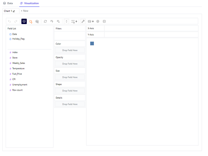
If it all worked as expected, you should see a jupyter widget as shown below

On the left you have all the columns in the dataframe separated by numerical vs non-numerical.
Data View
In the top left of the widget you’ll find a “tab” called Data. Clicking on it will take you to the data viewer. Here you can take a glance at the data as well as seeing the inferred dtypes (semantic data types) which you can change in the event they aren’t accurate. Quite useful to see, at a glance, the data layout, contents and data types

Charts!
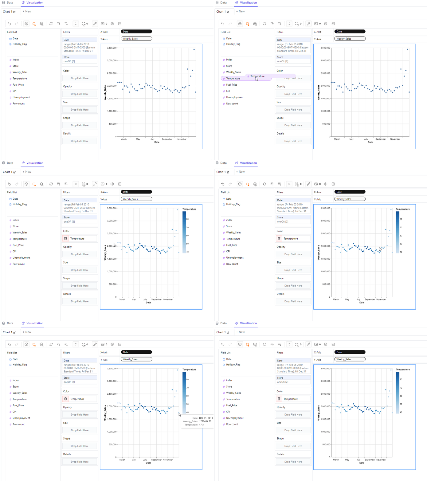
Let’s suppose you wanted to see the sales over the course of a year for a specific store. To do so pygwalker has the concept of filters. You can drag and drop fields to the Filter box and then click to configure each. In this case for the ‘Date’ filter I chose all weeks in 2010 and store id 2. I then drag and dropped the ‘Date’ column in the x-axis and ‘Weekly_Sales’ in the y-axis:

Not too shabby. But let’s say you wanted to find out if sales were correlated to the average temperature in that locale (it’s included in the dataset). To do this, drag and drop the ‘Temperature’ column in the Color box, and we get the following result:

As you can see, it adds a legend to the right, colors the dots according to this legend and also adds the values to the tooltip as we hover over individual data points.
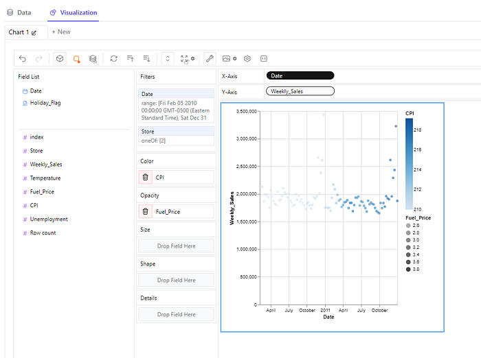
Let’s take this further, let’s see is sales for this particular store are affected by CPI and/or fuel price, and let’s also stretch out the date filter to two years instead of one. To do so, drag and drop ‘Fuel_Price’ column in the Opacity box and the ‘CPI’ column to the Color box. This will create a relative opacity and color scales and apply it to the plotted data. Click on the ‘Date’ filter and add an additional year to the range. After doing so we get the following chart:

Now, let’s say we wanted to compare the sales of two different stores. We first clear the Color and Opacity criteria and then click on the ‘Store’ filter and choose the store ids we want to compare (in this case 3 and 4). Additionally in order to differentiate the two different time series, we need to drag and drop the ‘Store’ column to the Shape box. After that’s set up the chart looks as follows:

And finally we can also add the same Color and Opacity criteria as before, perhaps we want to see if temperatures or CPI affect sales in one store more than the other. Just as before, it’s quite simple, just drag and drop the ‘CPI’ and ‘Fuel_Price’ columns in the Color and Opacity box accordingly. The chart now displays as follows:

PyGWalker has many more features than I can cover in this article. For example, you can plot aggregated data with various functions (median, mean, stddev, count, sum, etc.), choose from different plot styles, bin and log scale data, export images as png or svg, stack charts, and much more.
I think PyGWalker is a great tool for data analysis. It is easy to install, use and get insights from. It is still in development, but it already offers a lot of value and I’m excited to see its future improvements and additions.
